An Ode to Albers: Garbage Collage Homage to the Circle
A key figure in the Bauhaus movement, Josef Albers was an artist, writer, colour theorist and educator who had a profound influence on visual arts and graphic design from the mid-20th century onwards.

Josef Albers. American, born Germany (1888–1976)
Between 1949 and his death in 1976, he painted more than 2,000 variations of squares as part of his now-famous series Homage to the Square.
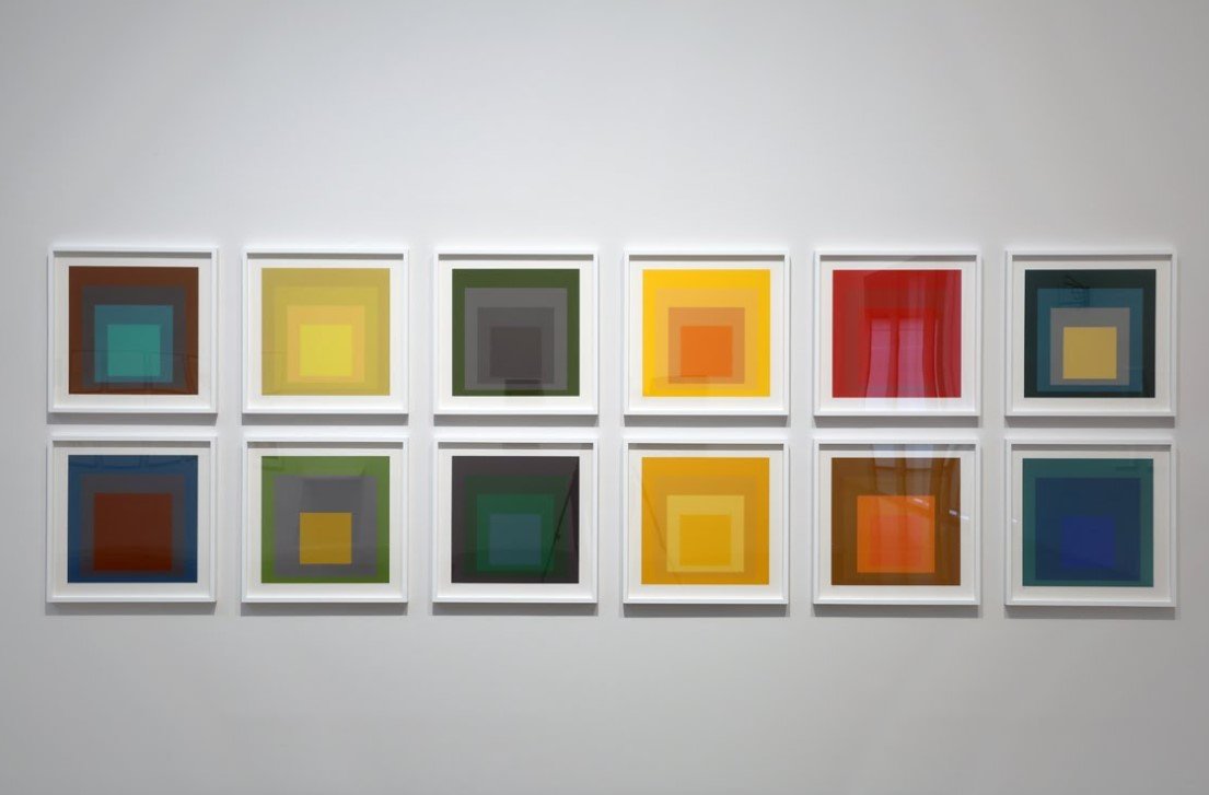
I am a huge Albers fan, and his Homage to the Square works are some of my favourite works by any artist ever. There is something about them that I find mesmerising and endlessly interesting.
Albers’ immense body of work and his commitment to continuously exploring a singular motif inspired me to commence a new series of works myself in mid-2023 which I half-jokingly titled Garbage Collage Homage to the Circle. Although I’ve chosen a different geometry and medium, the arrangement of shapes and the way in which the adjacency of colours influences their interpretation is where I am trying to pay direct tribute to Albers.


The title of the series—the pronunciations of Garbage, Collage and Homage are meant to rhyme—is intentionally playful, but it is also quite literal and serious. The works are essentially made out of unwanted materials. The canvases are all secondhand, and layered upon the canvases are collages made out of combinations of discarded materials that I had collected and set aside with the intent of someday repurposing them. Some of the materials were literally pulled out of the bin around my neighbourhood. While this process admittedly has a miniscule impact on the global problem of waste, I am a believer in the adage that every little bit counts, and, more importantly, my primary goal with this series, as with most of my work, is to instigate conversations about waste and hopefully nudge things in a positive direction.
Applying the Genius of Albers’ Colour Theory to the Waste Conundrum
Where I draw inspiration from Albers is that I think he was ahead of his time in his understanding of visual perception, colour sensitivity and emergent relational phenomena. I wanted to find a way to extend his unique artistic and intellectual approach into contemporary discussions about waste—as in, the way society relates to waste, the way we perceive it, the ways in which we let ourselves be deceived by the illusion that waste magically goes ‘away’ to some other place where it is no longer our concern.
I believe most people have some vague sense of the interrelatedness of everything, yet we tend to think of waste separately, as if waste is not part of our local or global interconnectedness, as if it somehow exists outside of everything else. This makes waste a uniquely human phenomenon. Waste is an integral part of regenerative cycles in nature, but humans have yet to figure out how to model our relationship with waste after nature.
The nested circles in this series, therefore, represent aspirational connectedness and continuity and, like the concentric rings of a tree, they also represent growth. However, the underlying suggestion is that we should really only pursue growth with circularity in mind (as opposed to within the context of traditional economics where waste is rarely properly accounted for). In short, these circles invite us to ‘think outside the square’ when it comes to waste.

A Slightly Different Artistic Approach
Whereas Albers’ Homage series consisted of mostly oil paintings and prints, I’ve used mostly discarded paper, cardboard, packaging and plastic. And whereas he painted in a meticulous way so as to avoid the appearance of any texture, I very much want to highlight the texture of the materials and layer them so that their three-dimensionality is prominent. The circles are all hand-cut. In some cases they are stained or torn. They are not necessarily perfectly aligned or proportional. It is garbage, after all, or at least it was until it was salvaged, and that’s the whole point (it’s a feature, not a bug, as the saying goes). This isn’t an homage in name only; the quality of ‘garbage-ness’ is meant to be visible. The goal was to resist the urge to hide any imperfections and to let the materials speak for themselves. While I do enjoy reimagining what a given material could become, I also like to make its provenance conspicuous whenever possible. It’s about prolonging the life of a material as it is, honestly and with minimal intervention or further degradation.


Unlike Albers, my artistic process tends to lie somewhere between creating so-called readymade works of art and creating works of art via some kind of transformation. It also lies somewhere between deliberate and arbitrary. Although partially planned out, it’s more improvisational than anything, and that’s largely driven by the self-imposed constraint of making use of whatever materials are at hand. That said, I’m not trying to pull rubbish out of a bin and call it abstract art, nor am I trying to completely alter a material in such a way as to make it appear to be something that it’s not. The goal is not to ‘trick’ the viewer or to say, ‘You’d never guess what this used to be.’ In that sense, it is meant to be direct and approachable.
The Beauty of Repetition
Some might see Albers’ Homage series as repetitive and boring, but to me, the repetition is what’s great about it. I see in Albers’ work what I like to call formulaic fun. He followed a set of formal rules, but he used that to his advantage rather than seeing it as a limitation. For me, doing my own spin on Albers’ Homage never gets old, and I suspect the same was true for Albers back then. Any time I see one of his Homage to the Square works in a museum, and even if I might’ve seen the same one before, I can’t help but pause and spend some time with it. Sometimes they seem playful, sometimes they seem solemn. That’s just the nature of colour, I suppose. Depending on the colours and the context and the mood that one brings to the interaction, a viewing of one of his Square works—a viewing of any artwork, for that matter, no matter how simple—can be deeply absorbing and meditative.
You wouldn’t expect something as compositionally simple as a few concentric squares to be capable of holding your attention for very long, and yet for me, Albers’ works always feel fresh and intriguing.


Even though he basically explored more or less the same theme over and over again, no two Homages are totally alike, and that’s probably why Albers never tired of making them. I think he enjoyed compulsively exploring the endless possibilities of colour combinations and interactions.
I have my doubts about doing the same thing over and over again for decades like Albers did, but we’ll see. However long my Garbage Collage Homage to the Circle series continues, I hope I can continue to honour Albers’ legacy in my own humble way. However it evolves, I just hope that it allows people to experience a familiar motif in a new way, hopefully in a way that remains relevant to contemporary discussions about waste and resources and the conservation of our planet.
A Note on the Illustrative Superiority of Concentric Circles (at least in this instance)
There is one piece where I slightly deviated from the concentric circles and incorporated a sort of Venn diagram composition which I think warrants some explanation. For one, while my work is rarely explicitly political, I think in this case I was subconsciously trying to hint at the need for more bipartisanship when it comes to addressing the problem of waste. It might not be immediately obvious, but the Venn diagram layer of the work is essentially composed of red and blue circles, colours often associated with dominant and opposing political parties.

Issues around climate and energy seem to be inescapably partisan and divisive, but I’m holding out hope that our government leaders at all levels can find some common ground in addressing the problem of waste—figuring out ways to minimise it, disincentivise it and use it as a resource—as opposed to just ignoring the problem and continuing to allow our economies to unaccountably create more waste because of the false notion that we can always just send it ‘away’ (i.e. fill up more landfills). Maybe I’m naïve, and maybe my ‘independent centrist’ views are problematic, but I truly believe that designing waste out of the system is something that everyone can get behind regardless of their political leanings. My hope is that viewpoints that might have once been considered fringe will start to become more mainstream and perhaps even seriously compete in what have traditionally been duopolistic systems of government. One doesn’t have to be fanatical about climate change or be an environmental activist to see the absurdity of the amount of waste that we produce.
Secondly, the Venn diagram juxtaposed against the concentric circles also alludes to an important comparison between two different ways of thinking about sustainability that I think needs more attention. The difference is subtle, but it’s important.
People often use a triadic Venn diagram to illustrate the concept of sustainability when describing a common approach to sustainability that involves ‘balancing’ environmental, social and economic priorities. This is often called the ‘triple bottom line’. However, in some ways, this is erroneous.
A better, more holistic approach that takes into account the dependency hierarchy of these three elements would be to ensure that economic priorities are only a means to improving society and the environment. In other words, we should be striving to achieve a healthy economy within a healthy society within a healthy environment. People seem to forget that we can’t have a healthy economy if we don’t have a functioning society, and we can’t have an optimally functioning society if we don’t have a healthy planet.
I like concentric circles as a mental model for a lot of things, and I think that in this case they prove to be a fairly helpful way of illustrating what we should aspire to when we talk about sustainability. Whether or not the particular artwork in question conveys this explanatory power on its own is another topic for another blog post (perhaps titled ‘Should Art Require Explanation?’), but for now I’ll take advantage of the opportunity that this platform affords to communicate some of the thinking behind the work.


What Would Albers Think?
I’d like to think that Albers would appreciate my nod to his work. At the very least, I think he would understand that my goal is simply to get people to see a subject from a new perspective… He wanted people to see colour from a new perspective; I’m just trying to get people to see waste from a new perspective.
Ideally these nested circles will have a ripple effect (pun intended). Not only are they honorific of a great artist and thinker who challenged conventional ways of seeing, but because they’re made out of reclaimed materials, perhaps they can go so far as to challenge conventional ways of thinking about waste.
If nothing else, they raise a simple question: What should happen to materials after they have outlived their originally intended use? Do they belong in a landfill, or, just as a circle has no end, do they deserve instead to be reconstituted, reconstructed and reassembled indefinitely, perhaps as art, perhaps as something else?
Further Reading
For more information on Albers, check out the website of The Josef and Anni Albers Foundation (albersfoundation.org), an organisation which is ‘dedicated to preserving and promoting the achievements and philosophical principles of the Alberses,’
There are also a number of great books out there, but a favourite of mine that I keep coming back to is Interaction of Color.
